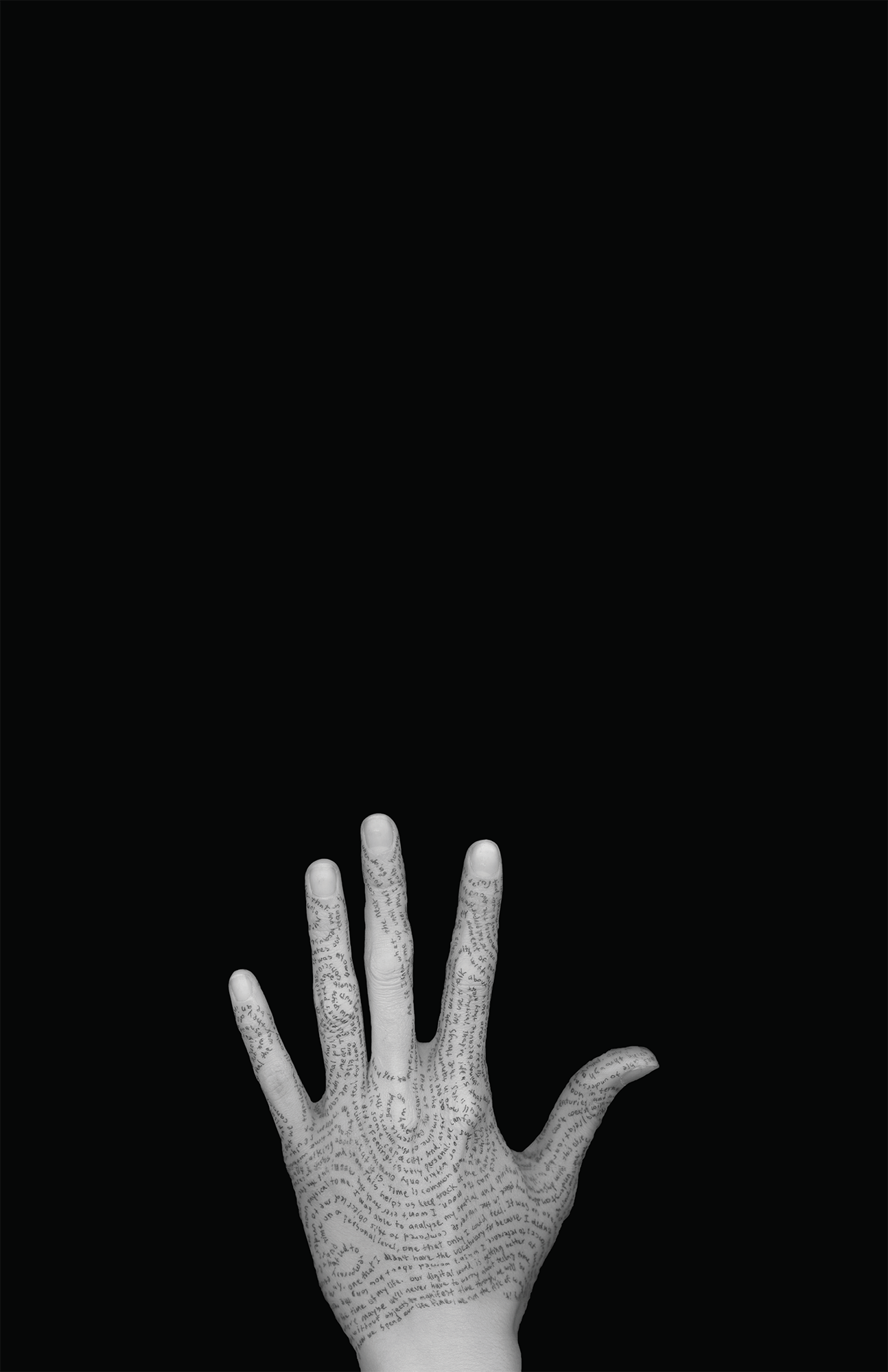
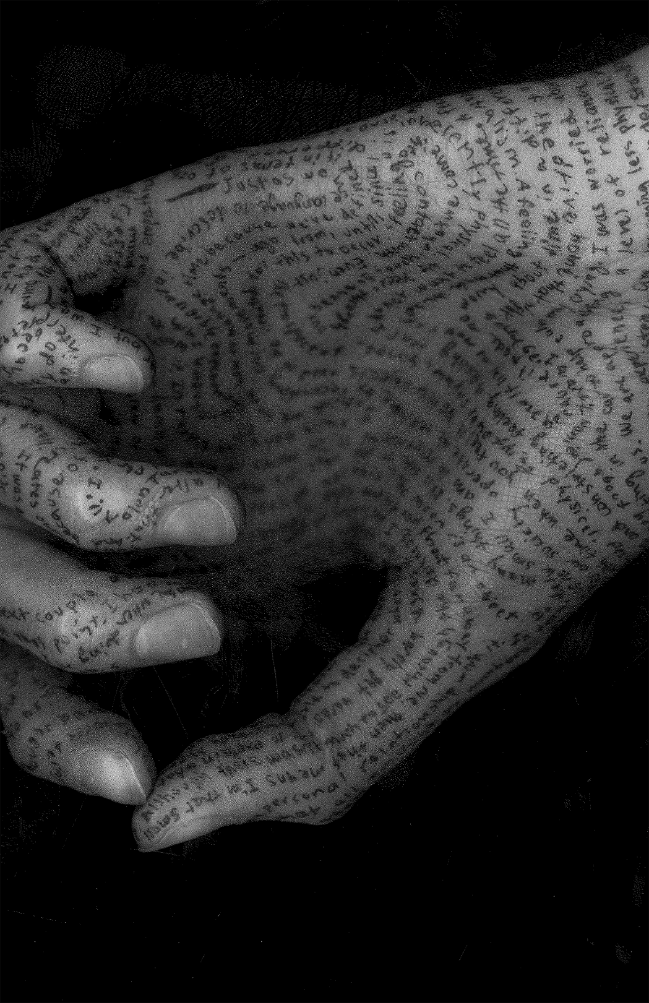
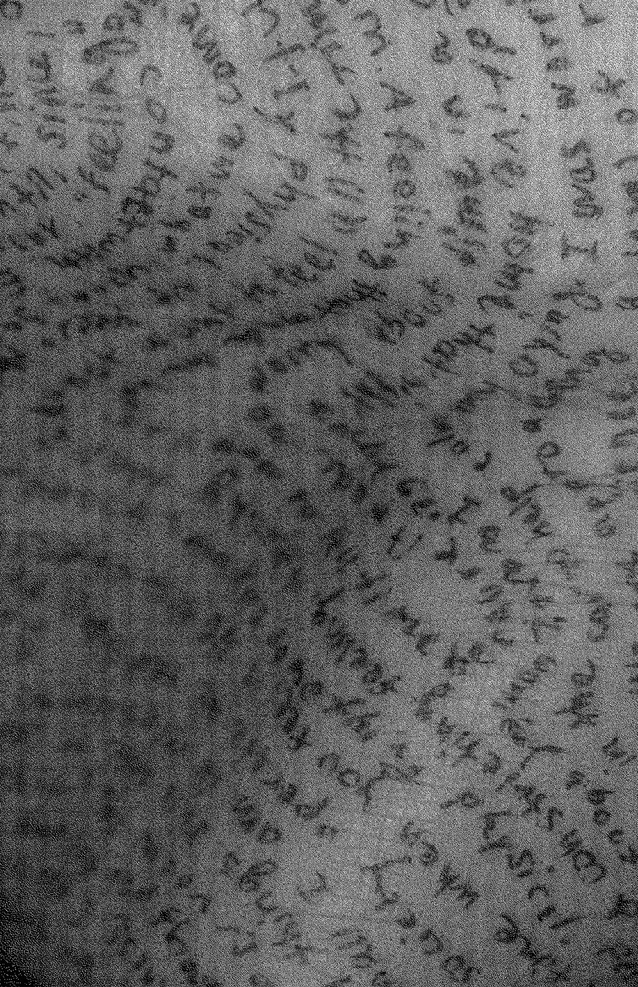
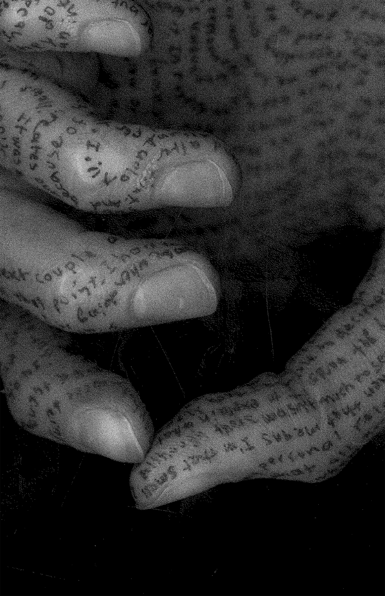
Project 1/6: Time to Feel
On May 3rd, 2019, I spent two hours using my right hand to write a 1,032-word essay on my left hand about how to feel time, rather than tell time. Request a copy of the essay.


“The five elements of image generation—paths, edges, districts, nodes, and landmarks—were based on the assumption that they constituted recognizable images for the city inhabitant making his way through different parts of the city.”
—Kevin Lynch, Image of the City
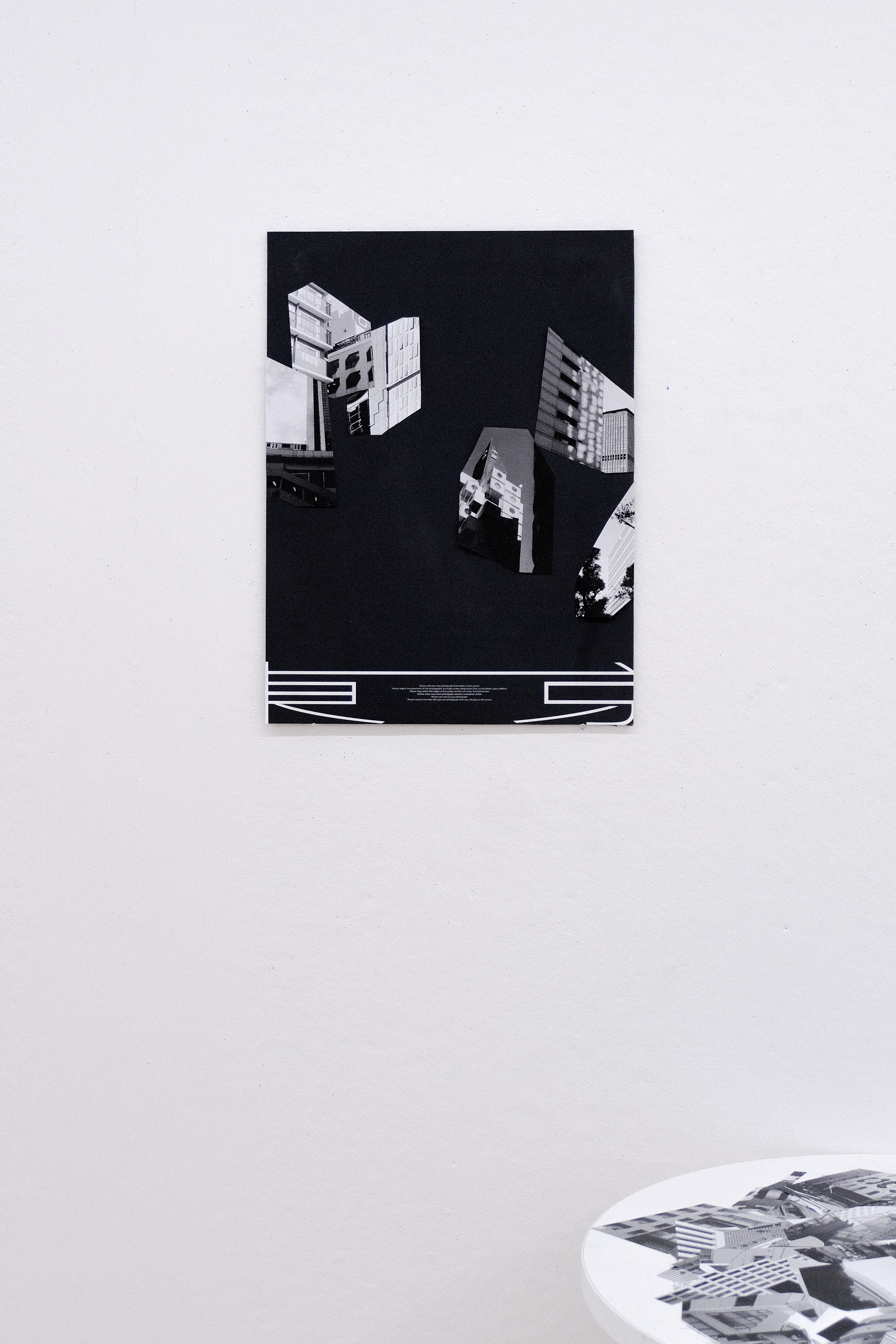
The composition of this 18” by 24” poster is always in flux. The bottom graphics—an abstract iteration of Japanese characters (東京 meaning Tokyo) and the small text between them—are the only fixed elements on the black surface. The irregularly shaped, seamlessly placed photographs are detachable. Viewers of the installation are encouraged to interact with the poster by rearranging, removing, and adding photographs.
The poster’s surface represents Tokyo. The bottom graphics create a horizon line for ever-evolving Tokyo to be grounded to. By transforming a 3D environment into a 2D experience, I understood how we remember a place, what we take away from a city we travel to and what visions create a mental imprint of the place that we can always bring ourselves back to.


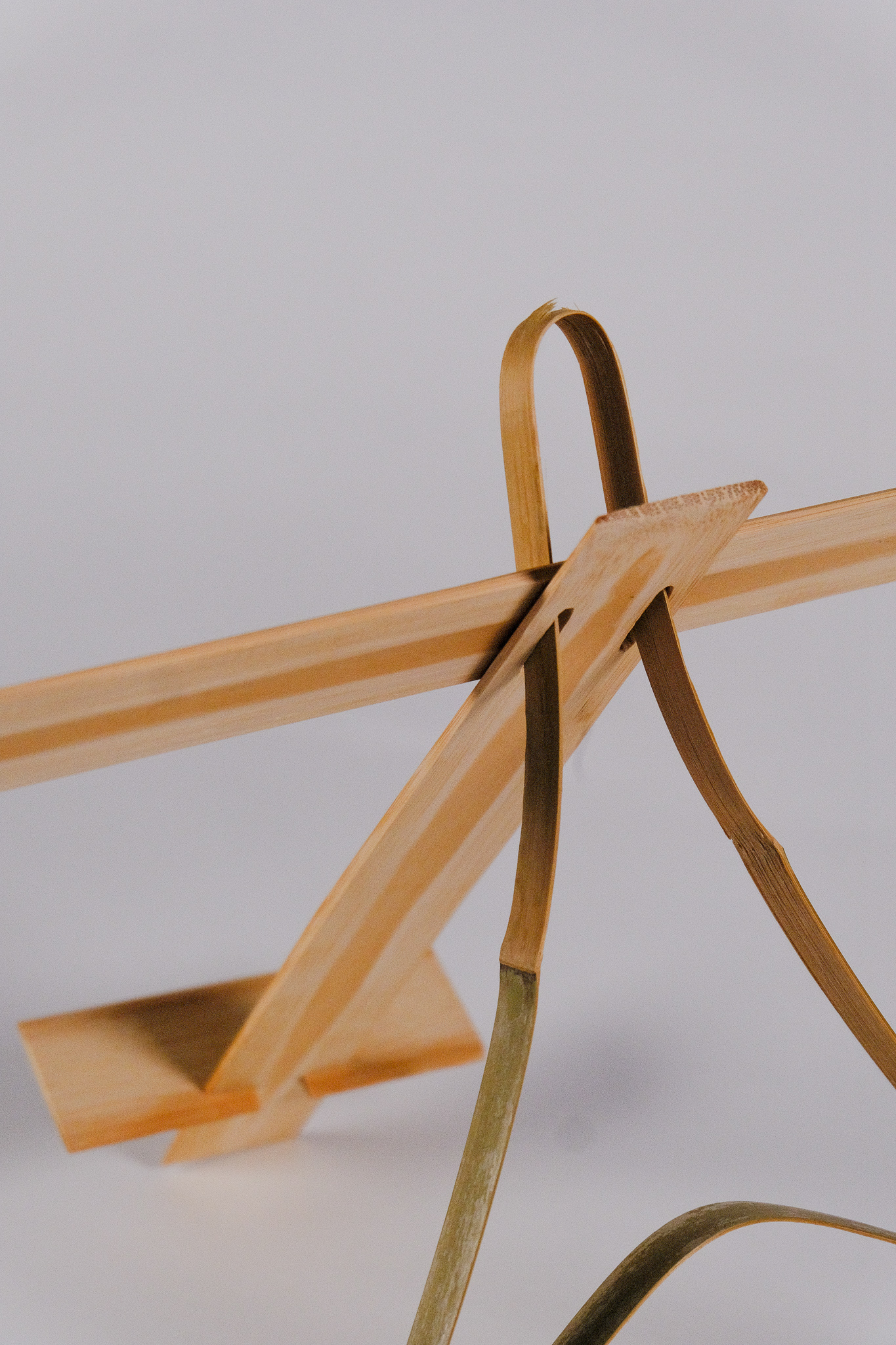

This book stand is a physical manifestation of how I see Japanese language. 本 [hon] is the kanji for “book”. This character is seen in the kanji for the word meaning “Japanese language”. Being inadequately fluent, I don’t see the written language—hiragana, katakana, and mostly kanji—to represent a word or have an obvious translation. More so, I see a balanced visual structure of elements arranged to create positive and negative space.
I constructed this book stand in the order in which the character is written. There are five strokes and I used five respective, forgotten scraps of bamboo. The dimensions of this design could vary but these predetermined dimensions are based on remaining pieces I found.
立本 is not meant to be perfect—in fact, it is quite flawed. It is crooked, unstable and inharmonious. It is a somewhat functional object whose meaning outshines the beauty and practicality. The most curved part is already tearing and could easily break if too much pressure is applied.
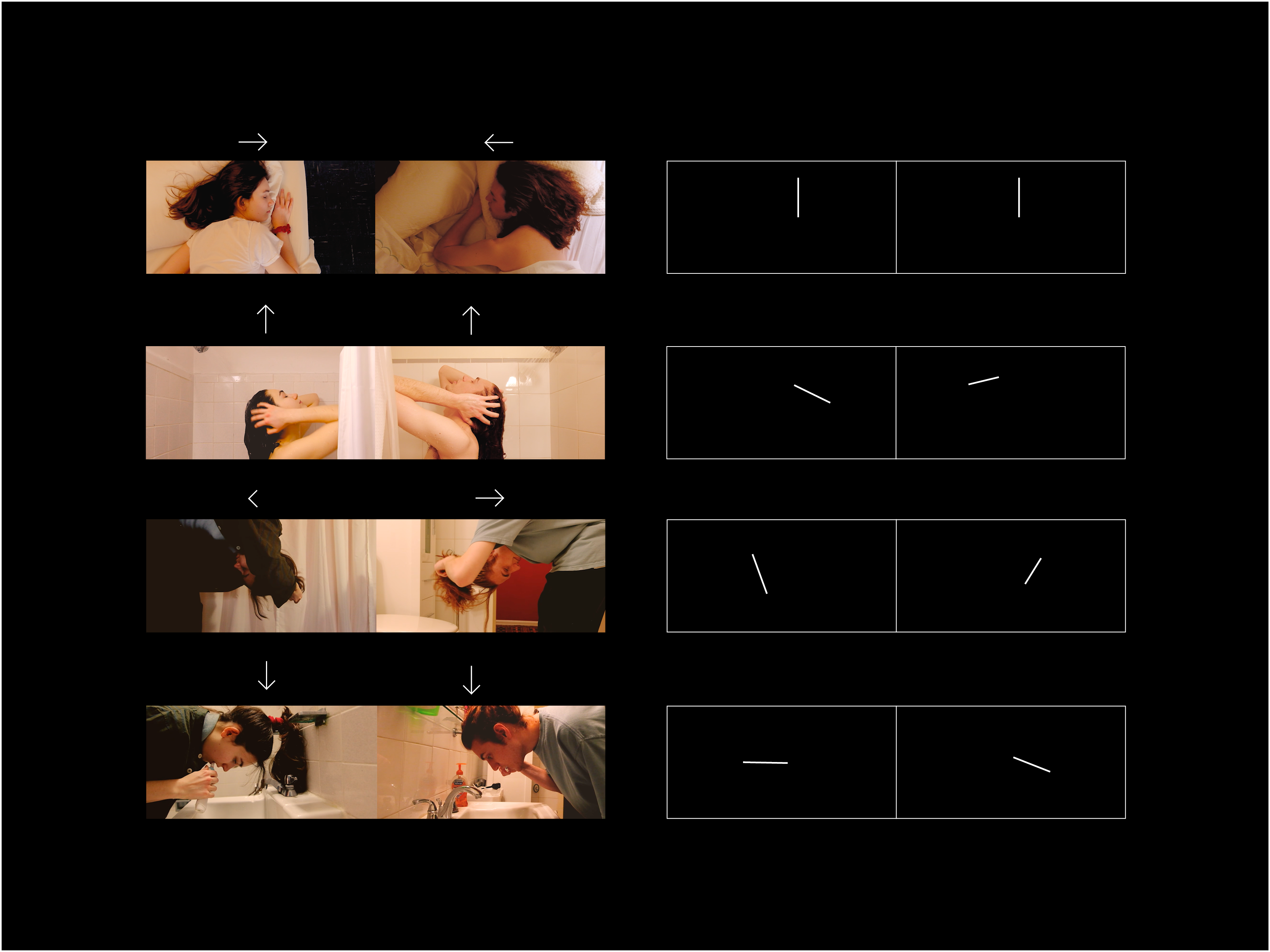
By showing the parallel behaviors of two assumed strangers, I wanted to express my fascination with how we lead similar lives to people we have not and will never meet.
To visually prove this correlation plus the passage of time, the profiles of the two subjects rotates frame by frame. Georgica moves counterclockwise, while Evan moves clockwise.